My Work

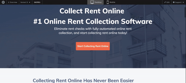
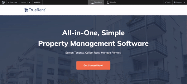
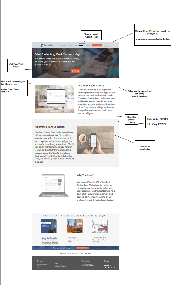
With that knowledge, we decided to follow the 60-30-10 Rule. It's a classic decor rule that helps create a color palette for a space. It follows that 60% of the space should be dominated by one color, in this case, white. 30% should be the secondary color, in this case, blue and the last 10% should be an accent, orange. We also found too much text added confusion so we removed the multiple bullets, and made a simple bold title, with the option for the user to interact with the site, scroll down, and learn more.
TrueRent started in 2014. I quit my marketing job to work for TrueRent full-time in 2018. It was time for a makeover. We took years to develop this software, and the web design needed to coincide with the high-level, intuitive, and all-encompassing product we had created. Our original design contained three colors, that were quite monotone. Through research, we discovered that it only takes 60 seconds for people to make a subconscious judgment about a product based on color alone. Therefore the chosen colors can be useful in the way of improved conversion for our product as well as advanced usability of the product.
We’re talking old school…


With the color palette transformation, now it was time to simplify, simplify, simplify. As a user, too much text on the screen immediately upon arriving was discouraging, and users responded better to a larger, bolder font. Additionally, the previous homepage had a lot of hard lines, creating borders, and movement, which didn’t benefit the user experience. With the new homepage, we wanted to create a flow that streamed downward, enabling the user to keep scrolling with one movement to learn further information, and ultimately click around to learn more.
Once we worked with font, typography, color scheme, and iconography, we redesigned every subpage of the website. Prototypes below.
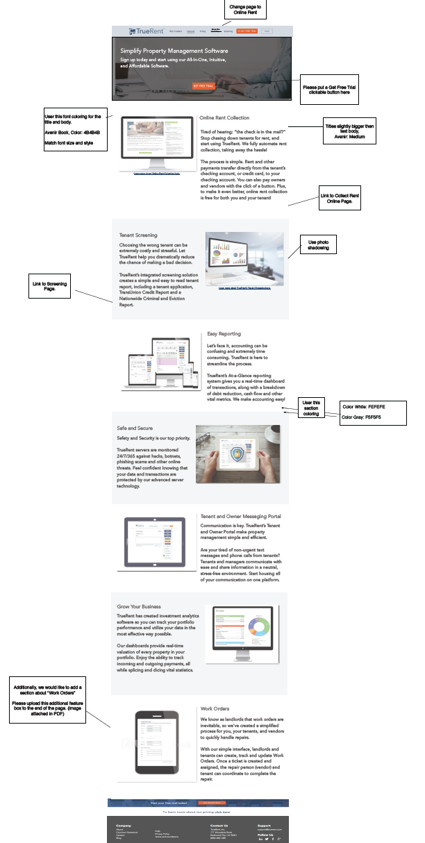
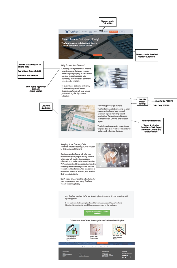
We knew we need to focus on product description, imagery, colors, and supplementary products. We wanted the user to be able to find all of their answers in one place, while sectioning appropriately if the user is coming to your site for one purpose.
While we wanted to provide enough detail, we also wanted to make the site scannable. Adding pictures and larger text allows the users to quickly find what it is they are looking for. Making it simple, with a clear call to action, allowing for a smoother user experience.
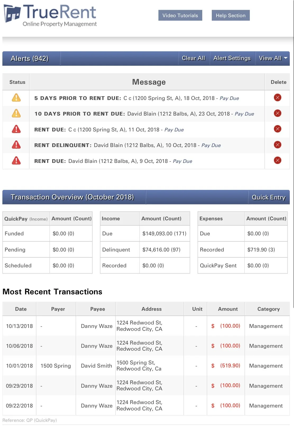
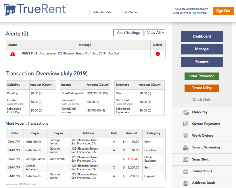
Our original design from 2014 was functional but too cluttered. From direct user feedback, we collected the necessary data to keep and alter the navigation of the home page.
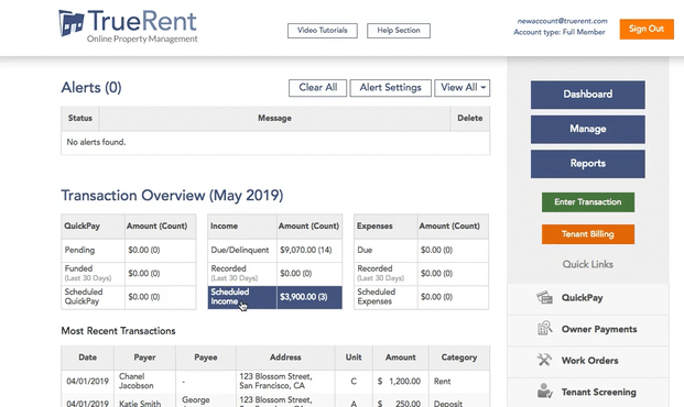
We wanted to keep the Alerts, users found this extremely helpful, allowing them to address the necessary items, like delinquent rent for example.
We kept the Transaction Overview, as well as Most Recent Transactions, but added a very clear navigation bar. This bar allowed users to glide through the site more easily, accessing the necessary sections.
Original
Redesign

Tenant Screening was an available feature, and quite popular at that. Tenant Screening is vital in property management, as this simple step can create safety for both your property and other tenants. Our Tenant Screening compromised of Credit Report, Eviction Report, and a Criminal/Background Report. The Tenant Screening was completed by a third party provided. A user would log in to TrueRent, and when they clicked into their Tenant Screening Portal they would be taken to a new webpage. While the service was fulfilling the needs of our users, some experienced struggles in using a third-party website to complete the reporting, so this is what we did about it.
-
Some users would be locked out of the account for various reasons, incorrect SSN, too many attempts, entered a question incorrectly, etc. When they were locked out of the system, they needed to contact TrueRent, and then TrueRent needed to contact that third party.
-
When our team reached out to the third party the answer wasn’t always immediate. Our users then had to wait until we heard back to relay information or have to go through a back-and-forth in order to fix/determine the problem
-
We were unable to see where a tenant was in the application process. Many users wanted to know if there tenant had opened the application, started the application, etc.
So What Were the Pain Points?
Tenant Screening Integration
Original Tenant Screening
With the user feedback, competitive research analysis, and data collection, we decided to build an integrated tenant screening system
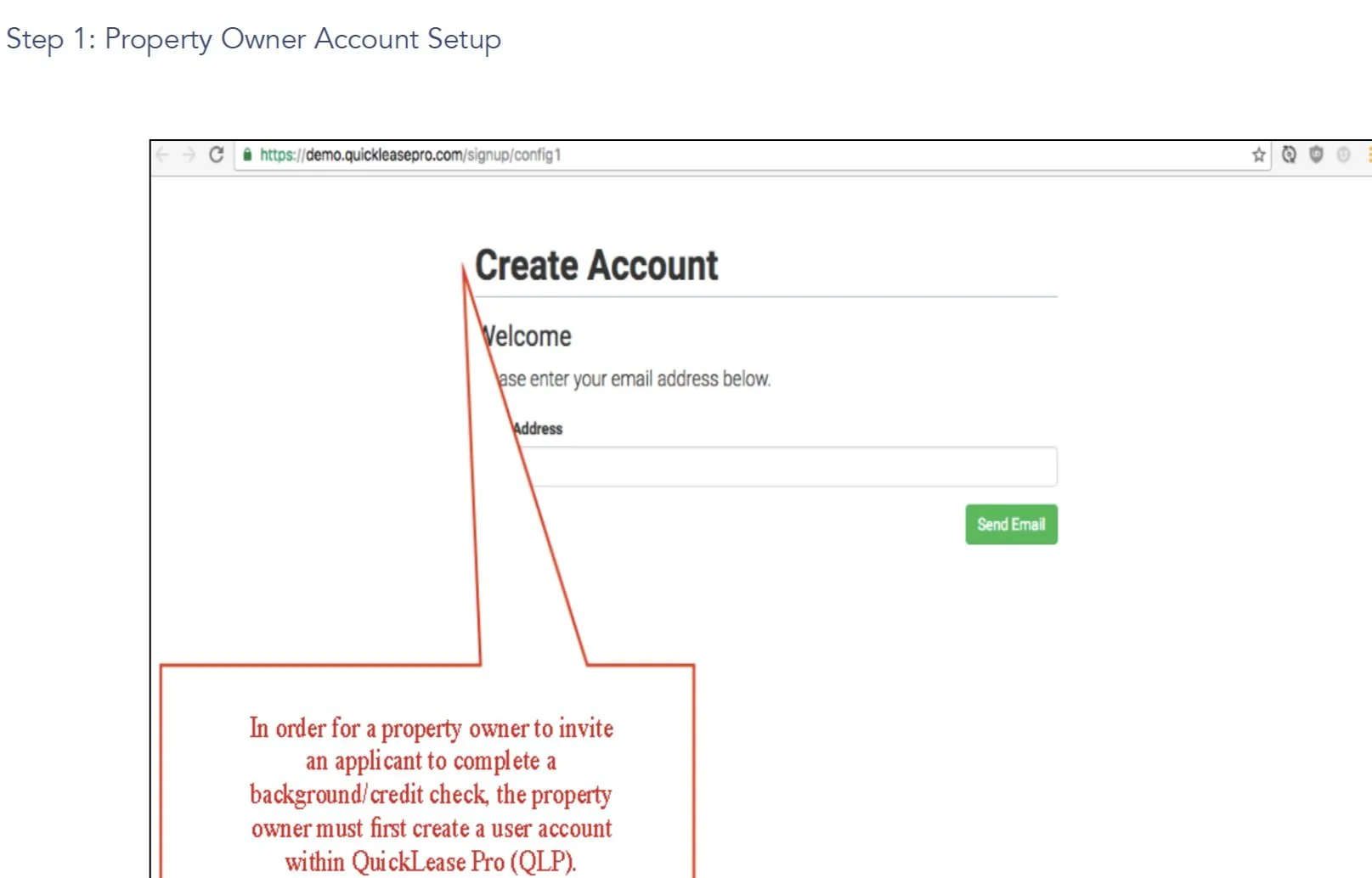
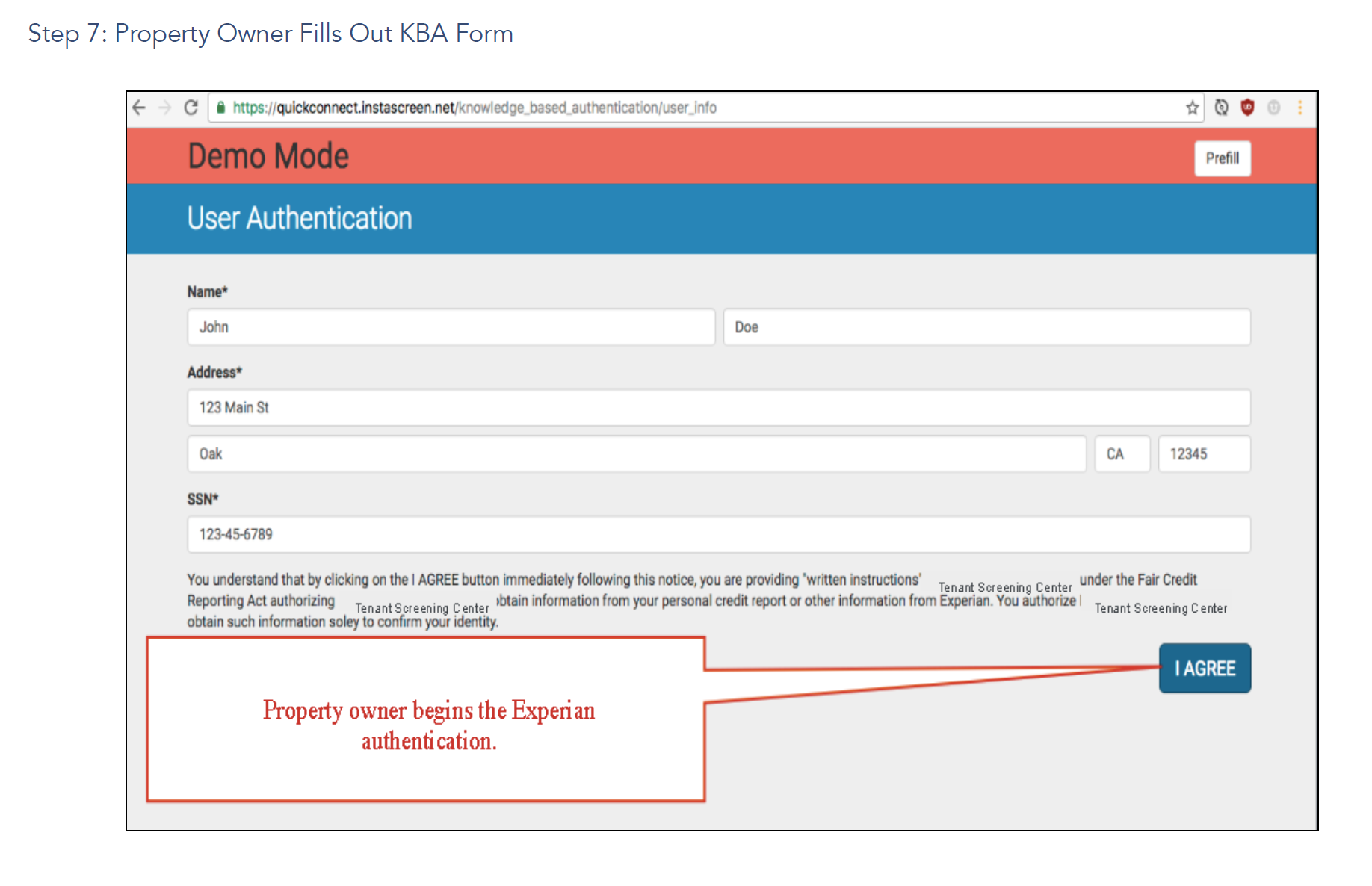
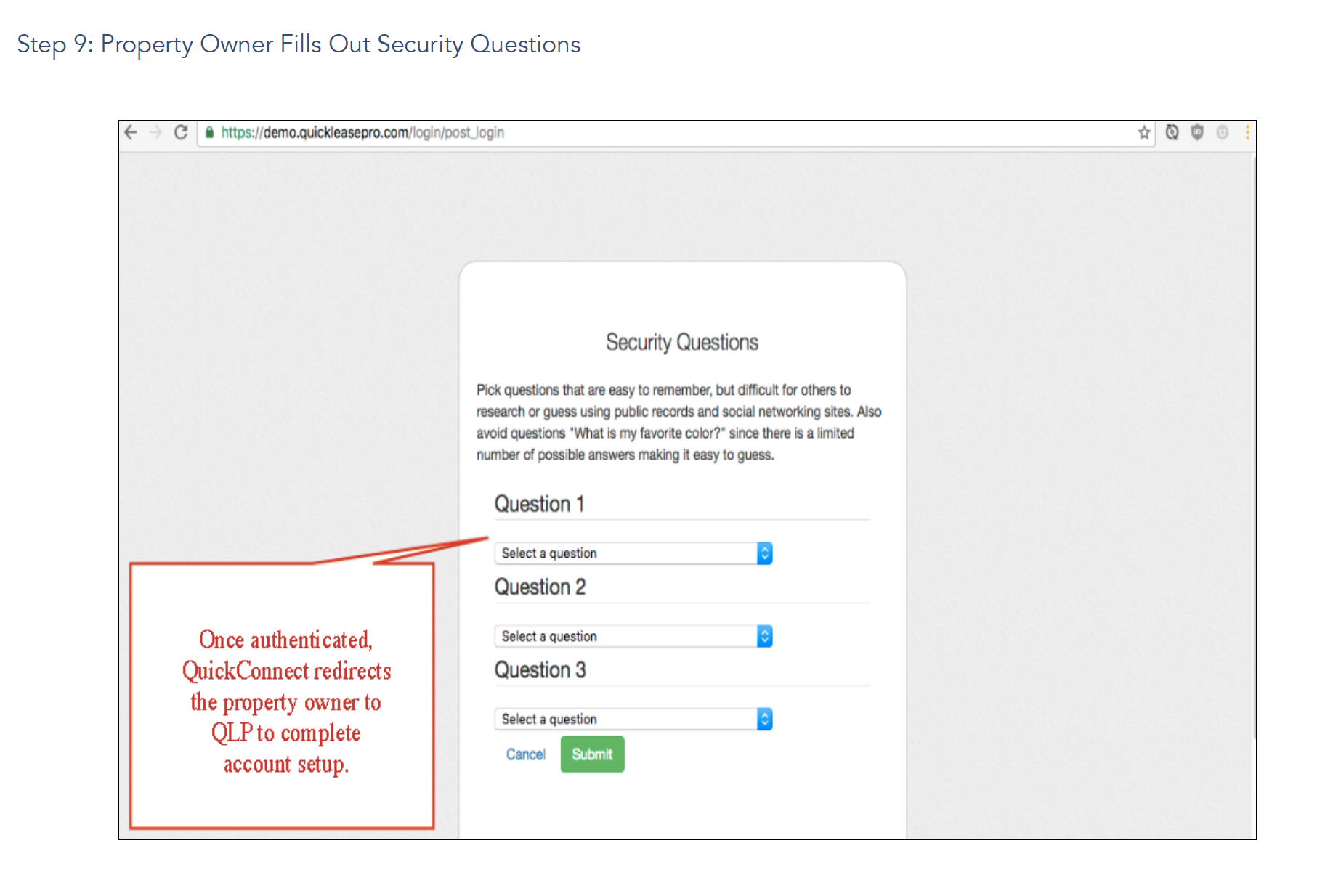
The original Tenant Screening was done through a third-party website. The original flow images are attached below. As you can see the site was extremely outdated and tedious. While the process needed to ensure security and safety measures we wanted to eliminate repetitive actions. We wanted to keep the same flow, easing the comfort of the transition for users, but wanted to house everything on our own software, and modernize it to complement and coincide with the rest of the site.
-
![]()
Create Account
-
![]()
Email Link
-
![]()
Open Email
-
![]()
Create Account
-
![]()
Signature
-
![]()
User Authentication
Description goes here -
![]()
Authentication Questions
-
![]()
User Authentication
-
![]()
Security Questions
-
![]()
Applications


Upgraded Integrated Screening
We had to dress that up a bit….we wanted to keep a similar flow, allowing the user to move through the process in a secure and smooth way. We followed the same flow but eliminated some double verification, signatures, and security questions. While the applicant had a process where they answered questions, signed, etc. we no longer needed to authenticate the landlord. This saved the users time most importantly, but also eliminated roadblocks. Many users would get stuck on security questions, and would then need to contact us to contact the third party. We removed the roadblocks in the activation process, and created a pop-up flow, showcasing the back. and forward options. We found our users needed much less support when adding the options to go back and forth showing what those options were presenting.
-
![]()
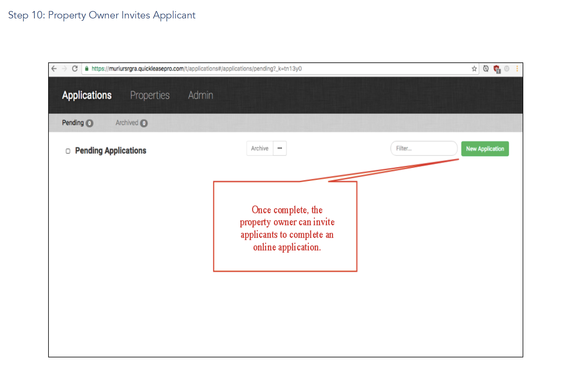
Tenant Screening
Access Tenant Screening once user logs into TrueRent account
-
![]()
Activate Screening
Input details to Activate Screening
-
![]()
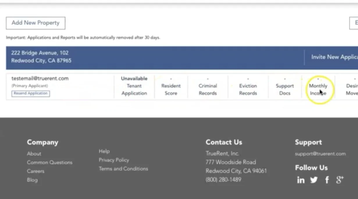
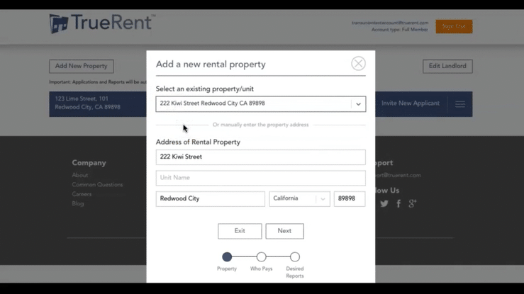
Adding Property
Able to select an existing property, as this is integrated to your TrueRent account, which houses all property details
-
![]()
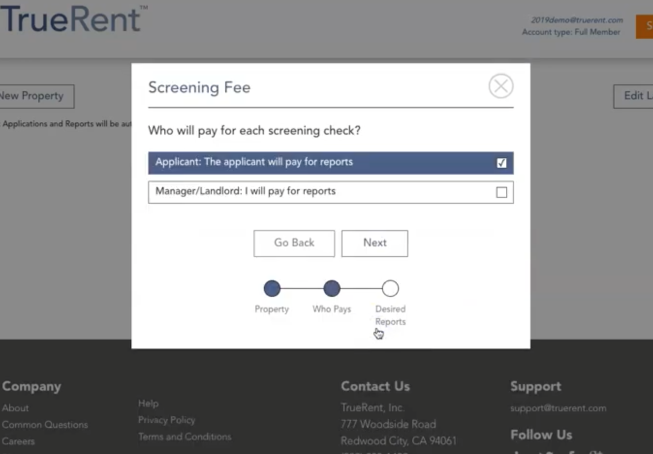
Screening Fee
Option to charge the fee to the applicant, or cover themselves
-
![]()
Select Reports
Option to select Credit, Criminal, Eviction, and Application
-
![]()
Select Screening
Option to only screen primary application, or additional applicants and/or co-signer
-
![]()
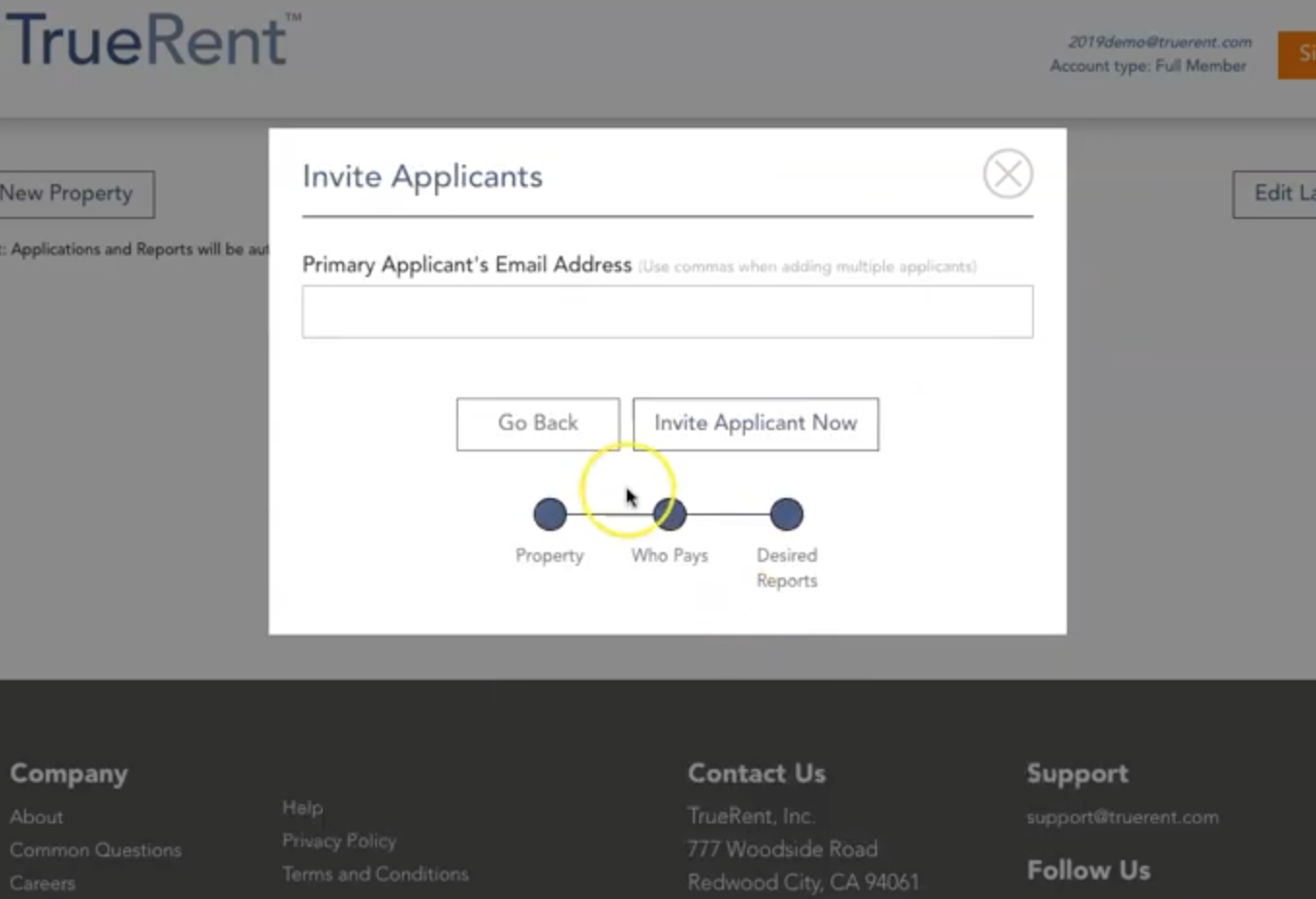
Invite Applicants
Invite the applicant via email
-
![]()
Add New Property
Option to add new property
-
![]()
Public Application ID
Option to add publication application ID to add to rental listing, ad, etc.


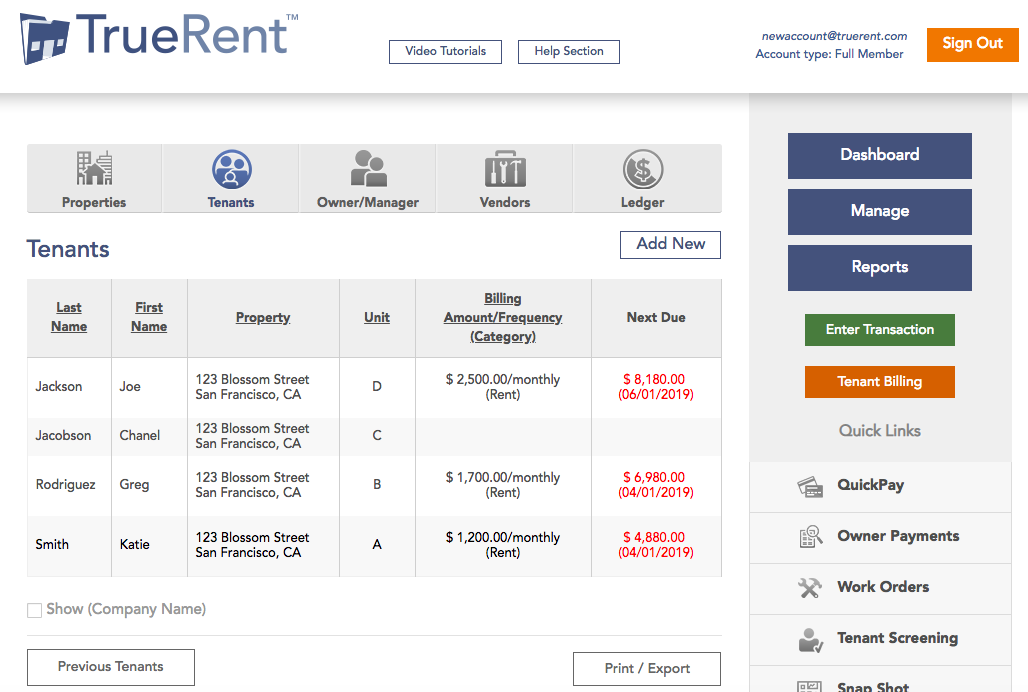
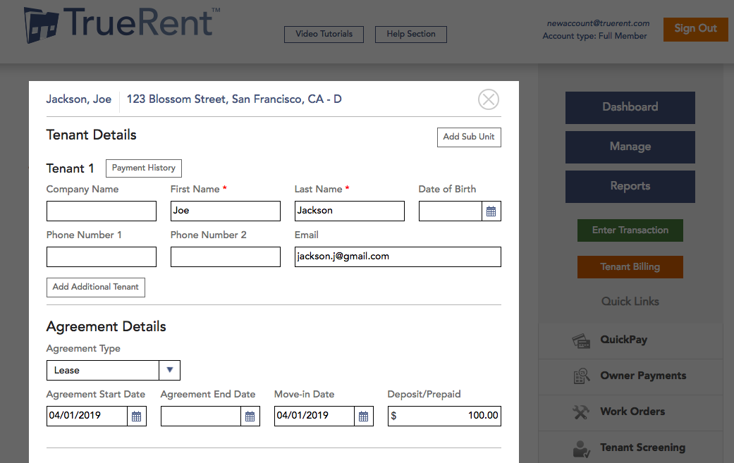
Tenant Management
Transaction Overview
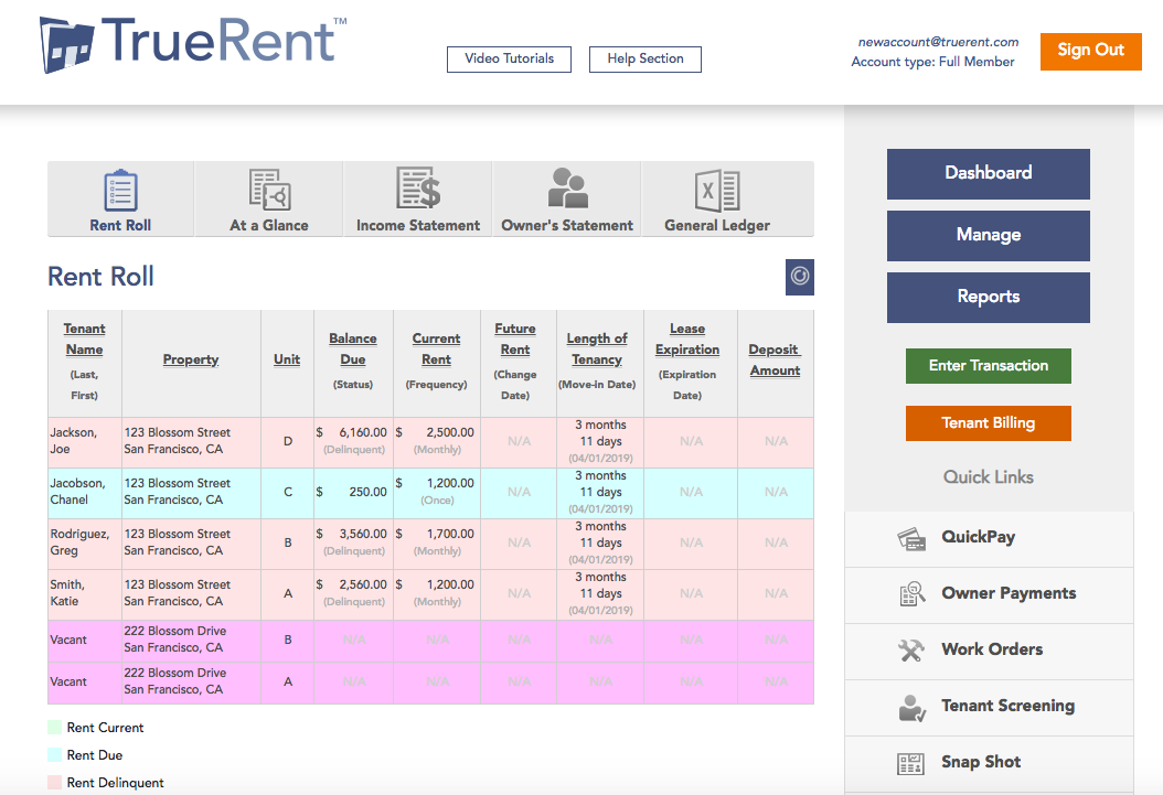
Rent Roll
Tenant Screening
Tenant Billing
Additionally attached is the Tenant Billing, Transaction Overview, Tenant Management and Rent Roll